|
Through our first five labs in class we have looked at how anthropocene affects the environment. Using this lense it was our job to inspect how human engagement has influenced our environment. Inspecting Land Use Cover Change, we looked at how human interaction in our own community may have altered the environment. Beginning with cooling data we also interviewed a panel of local residents and experts about change in the community. In this new lab we have shifted our mindset to look at the environment and its changes through a capitalocene view. This lense is an expansion of the more broad anthropocentric view. Here we still classify everything based on the age of man however, we look at how capital may have affected the decisions made by man. Different regions of the world began transforming one after another in a race to produce commodities. Nature became something outside of society and instead was turned into a set of objects that were available as commodities. Hartley explains this concept and its negative consequences by saying, “Its ultimate horizon is not the impending doom of ecological catastrophe and human extinction: it is the capitalist mode of production and its dismantlement,” (Hartley, 10). This reinforces the notion that a capitalist lense is to blame for intensified land use rather than just human nature. In this lab we will be using data from the Yale Environmental Performance Index (EPI) and merge data from the World Bank with it. The Yale EPI is a “careful measurement of environmental trends and progress provides a foundation for effective policymaking. The 2018 Environmental Performance Index (EPI) ranks 180 countries on 24 performance indicators across ten issue categories covering environmental health and ecosystem vitality.” (Welcome | Environmental Performance Index). Here each country is compared to the policy goal and a score is issued to the country based on their performance. Beginning by importing the Yale EPI data into a spreadsheet on google, I then imported the World Bank data. Since the country codes remained constant in both data tables it is possible to merge the two using a chrome extension. Combining the spreadsheets also allowed us to add a pivot table to track the averages per region, averages per income level, standard deviation, and country count in each group. As I looked at the date I decided to make 6 tables, Income compared to EPI, Region to EPI, and four Income Level to Region charts. Our first graph is looking at income level vs EPI score. A countries EPI consists of 60% ecosystem vitality, which include things like air pollution, water resources, biodiversity and habitat etc. and 40% environmental health which includes air quality, water sanitation etc. From this graph we can see as the income rises the EPI score also rises, showing a potential correlation in income and EPI score. Graph two is comparing the average EPI vs specific regions. I wanted to compare these different areas to see if it would show us which specific regions around the world have a higher or lower EPI. Regions like North America and Europe that are often known for being a leading developer in the larger global context possibly creating more progressive goals. These locations also have undergone the industrial revolution fully and consist of a more capitalistic system. The next four graphs break down each level of income into their own graph. I separated high income, upper middle income, lower middle income, and low income into regions. I did this to look at how each region preforms as each separate income level. The more developed nations that have undergone industrial revaluation tended to score better than regions that were still going through a capital transformation. In the low income region the Sub-Saharan Africa section remains higher than Latin America. This could possibly have to do with Kuznet's curve. The Kuznet's curve shows that as countries become more economically developed their negative impacts on the environment go up. Because of this the curve suggests that less industrialized countries have a lower impact on the environment. The curve also suggests that very industrialized areas may shift to being more sustainable. As you can see from our graphs, we did not see this trend too much. Instead we say that higher income sections boasted far better scores with scores getting lower the less income you made. The graphs suggest that more industrialized areas are having a better impact on the environment. The only issue I take with this is it may not accurately represent Kuznet's Curve. It is possible that the scores are set on environmental goals therefore some of these low income areas may not be meeting those goals but may still be sustainable regions. Hartley, Daniel. “Against the Anthropocene.” Salvage1, no. July (2015). http://salvage.zone/in-print/against-the-anthropocene/. “Welcome | Environmental Performance Index.” Accessed October 21, 2018. https://epi.envirocenter.yale.edu/.
0 Comments
Currently in class we are talking about analysis of environmental problems and how to go about looking at problems. One specific issue being looked at is climate change. Many reports today on climate change sound the alarm for large immediate changes and can be intimidating and scary. Sometimes I find it difficult to push through the news and have a positive outlook. Even with all the scary research being conducted it seems as though in politics, especially with our current president the warning are being ignored. Each time a new article comes out everything seems to get more and more complicated. Things like banning straws may be a positive change but we are still being hit with much larger issues it seems. The ball now seems as though it lays in our court. It is now our duty to take in all this information being thrown at us. For class this week we read, “Major Climate Report Describes a Strong Risk of Crisis as Early as 2040,” a piece in the New York Times. With threats as strong as these we have to remain open to new information we get in an attempt to possibly adapt. Something that could have this severe of consequences must be taken serious and action will also have to be taken upon receiving this information. We will need to decide what type of approach we are currently taking and if that can be altered or improved upon. Once we do this it is possible to reflect upon our analysis. We can look at the questions we had and possibly change them to address new questions or problems we found. Bottom line is each day new information on topics such as these come in and it has become our job to riffle through and start, even if a small step like straws, to make good decisions for a better future. “Major Climate Report Describes a Strong Risk of Crisis as Early as 2040 - The New York Times.” Accessed October 18, 2018. https://www.nytimes.com/2018/10/07/climate/ipcc-climate-report-2040.html. Recently we have been studying LUCC in the surroundings Lewis and Clark area. My group specifically had the opportunity to go and take data from a neighbor’s property in Collins View. Sometimes it is hard to imagine that there was a community here before Lewis and Clark was the main focus on Palatine Hill. As the population of Lewis and Clark grows so does its need to dominate the communities landscape. From aerial photos taken dating back to 1939, we are able to visually see the changes taken place. Sometimes though changes occur that may not be visual shown in documents.
For this reason we invited a group of residents from the community into class to help discuss the history of the area and changes that have occurred that may have been more subtle. Originally we assumed that RVNA, a natural area was the least changed of any of the 3 sections of the neighborhood (Lewis and Clark, RVNA, and Collins View). “That's the biggest change I have seen out of here that is not a natural area,” One resident claimed. Due to logging at one point the type of trees in the area have completely changed. Additionally residents have reported trail use to mountain bikers and illegal campsites from college students. Now the section is still in the process of changing. According to the RVNA specialist, the city, who acquired the land from the cemetery, is under a massive restoration process in order to make the land and trails more accessible for everyone. Land Use Cover Change, or LUCC, is a diverse way of looking at our changing environment. This whole process has stuck out to me as a real interesting way of going about “analyzing” environmental studies. Starting with Land Use Science, you can inspect multiple different levels of change to analyse possible impacts humans may have. This can be done at large scale and small scale levels, such as the experiments done in class in the surrounding areas of the Lewis and Clark Community. Through observations done by the scientific community, most of which put forth for everyone to use, we can make general assumptions about how environments may adapt and change based on our usage of them. Verburg writes, “One of the main achievements of the early LUCC work was the synthesis of case studies to identify common driving factors of change and causation patterns,” (Verburg, 30).
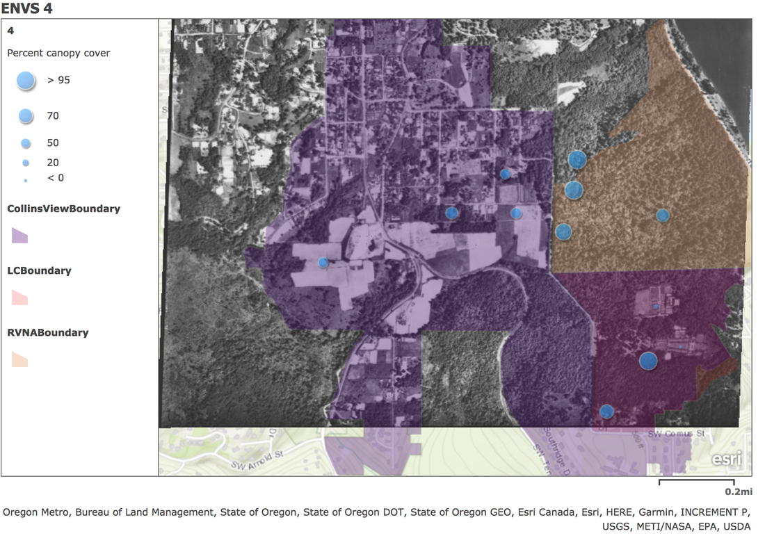
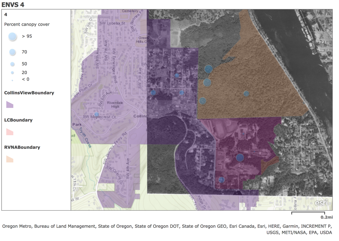
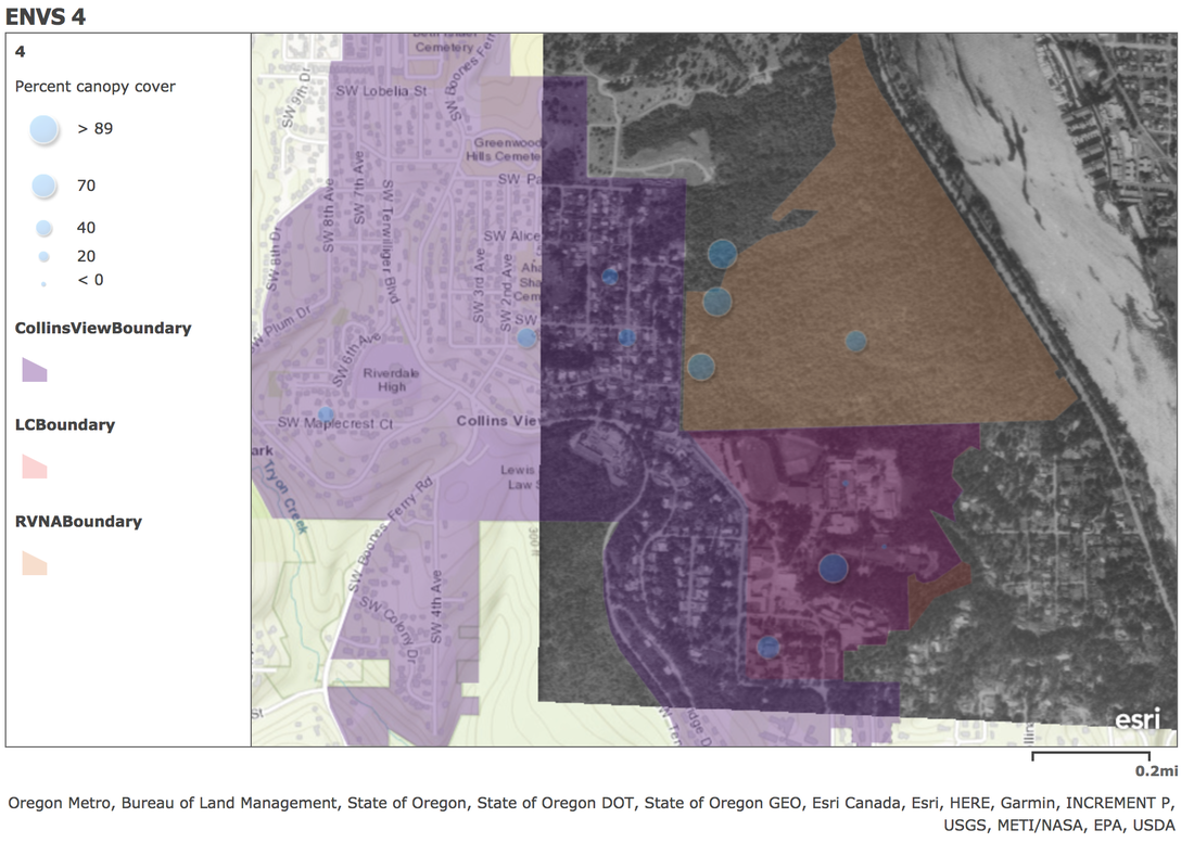
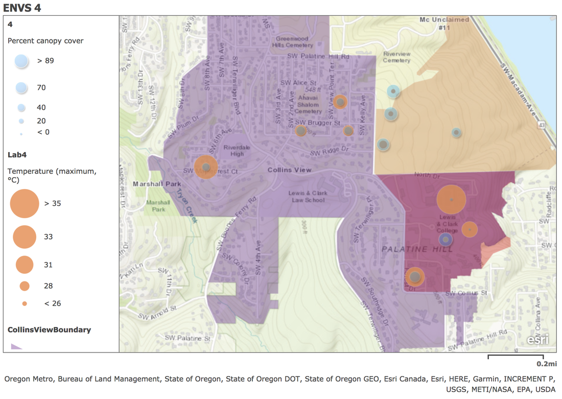
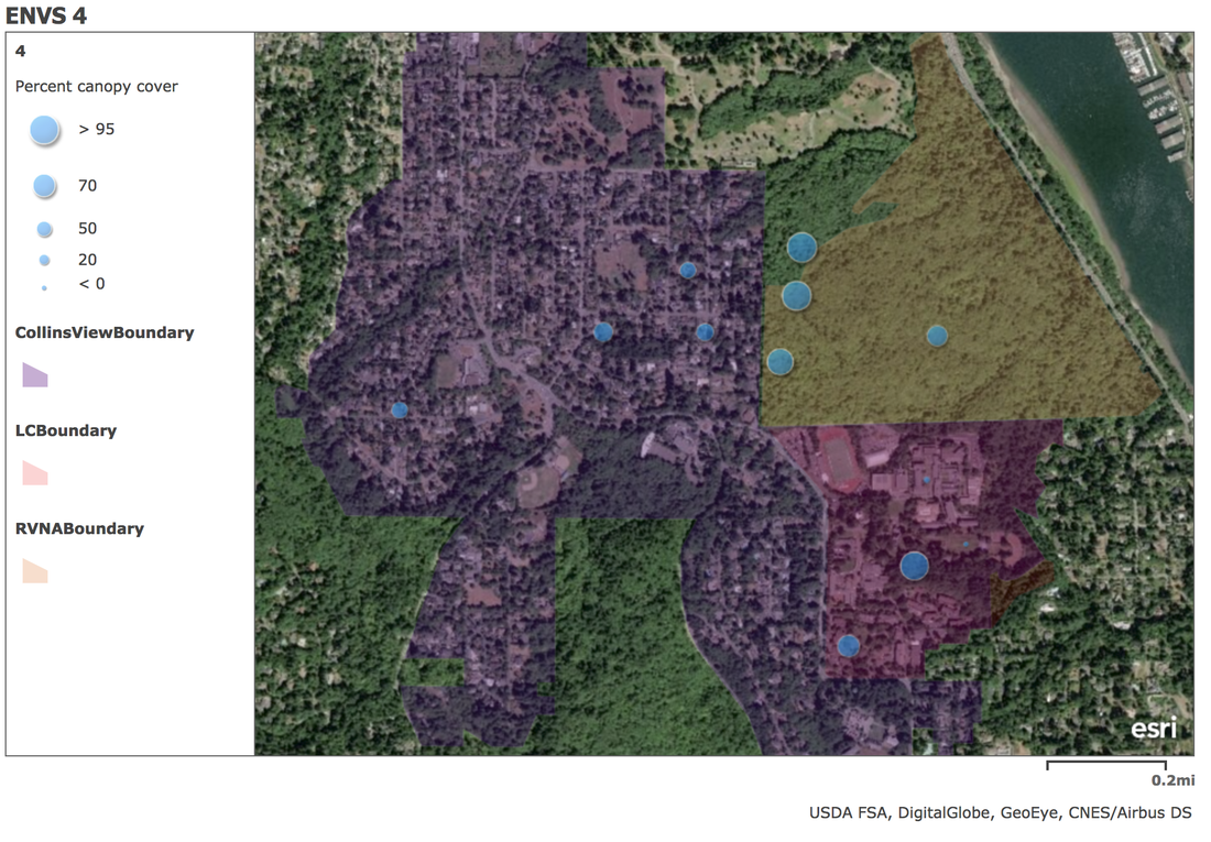
One of the industries Verburg looks at using this analysis is agriculture. “Changes in land systems can also result in increased carbon sequestration, due to e.g. the land-sparing effects of intensification, if not overcompensated by rebound effects (Lambin and Meyfroidt, 2011) or due to management changes in forests that do not result in changes in land cover, such as forest grazing or litter raking,” (Verburg, 34). It is inspection of land use like this that scientists may alter land use to better use the land. With greater knowledge of outcomes we can better anticipate outcomes of efforts such as land sparing. This can help yield higher quantity of crops while not overcompensating minerals that may hurt crop yields simultaneously. Verburg, Peter H., Neville Crossman, Erle C. Ellis, Andreas Heinimann, Patrick Hostert, Ole Mertz, Harini Nagendra, et al. “Land System Science and Sustainable Development of the Earth System: A Global Land Project Perspective.” Anthropocene12 (December 1, 2015): 29–41. https://doi.org/10.1016/j.ancene.2015.09.004. While continuing our study of land use cover change in the Portland area, we have started to map our data from our other labs in order to analyze change which may have occurred since 1931. Our last labs, posted here, were used to collect data from our specific site, a residential home in Collins View, as well as gain data from 11 other sites that our peers took, including Collins View, Riverview and Lewis and Clark, 4 groups in each area respectively. For this specific lab, we took all our data which we organized in our last lab, and began adding it to ARCGIS. This is a program that can give us an aerial map view of the sites separated by color, and the field points indicated, as you can see in the base map below in figure 1. The pink indicates the RVNA area that 4 groups went to, showing one outlier as one group went slightly farther than the designated area. The orange indicating the Collins view boundary, which had 4 more groups and the red indicates the Lewis and Clark boundary which also contains all 4 groups. Once we added the three separate locations of study, we entered all the collected data we comprised last week. This data consisted of humidity, temperature, canopy cover, ground cover, and more data from the past labs. We looked at many different versions of this map by applying different layers as well as adding 3 overlaying pictures. These 3 pictures showed the same area in 1939, 1961 and 1982 respectively. This allowed us to overlay different data points found by our teams of current data, over the older maps to analyze the land cover change, as you can see below. Starting by mapping temperature compared to canopy cover (figure 2). You can tell that more canopy covered recorded in a location has a correlation keeping max temperatures lower than in other areas with less cover. Canopy and ground cover are two of the attributes that visually change the most while looking at archived photos from the past. We have 4 different aerial photos from the archives, the 1939 photo, the 61’ photo, the 82’ photo, and the current google maps aerial for 2018. Taking the 12 research points we are able to overlay the different aerial photographs from the different decades to observe what the land us is for that time period. Starting with 1939 you can inspect the canopy cover and follow it as it changes. For our specific location in Collins View (45.46, -122.68), Land use visible changes between 39' (figure 4) and 61' (figure 5). Although canopy cover in the exact location does not change too much, the agricultural land around it does. The whole neighborhood starts the shift into a suburban setting. At the same time Lewis and Clark starts to transform it’s campus into the whole we recognize today. After 1934 the area in red was acquired to start an Albany College campus in portland and by 1939 you can see it taking shape. As of 1961 the campus takes shape. At the same time Collins View shifts into the residential area that we know. During all this RVNA stayed fairly consistent. If you compare the 1939 photograph with the current aerial images you will not find much change in canopy cover among the land. In each of the other sites however, canopy cover changes immensely over the roughly 80 year period. As stated in our past lab, this datapoint caught our attention. It seems to be the piece of data that is most different since the canopies may be keeping these areas from getting quiet as hot. Additionally ground cover could also assist in keeping these areas slightly cooler. As far as biodiversity is concerned, I am curious as to how these canopy and ground cover changes may be advantageous or possibly disadvantageous. Additionally I am curious as to how the changes between ‘39 and ‘61 may have shifted our land use and biodiversity in the area. We can now tell between the data and images that Collins View and Lewis and Clark share many of the same characteristics, whereas Riverview may represent more of what the area used to act like. To better understand these changes we would need to take more data from additional sites to see how much these changes have affected the environment. Accounts of the past may also help us to understand changes to re enforce the photographs. 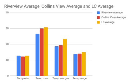 Matthew Weston
Lab Partner: Mackenzie Hoult 09/20/18 LUCC Analysis Analysis of ENVS 220 GLOBE Data This Lab has to due with the data recorded from previous labs in the Lewis and Clark Community. As stated here, our group recorded temperature, humidity, canopy cover, and ground cover from a residential home in the Collins View neighborhood. Other groups recorded data from different parts of Palatine Hill. In addition to the 4 groups in the Collins View community, there also was four groups in RVNA (River View Natural Area,) and four groups on the Lewis and Clark campus. After collecting the data in each group the information was entered into a document so everyone could access it and analyze the results. These procedures are similar to that of larger scale experiments done by Globe and others on a worldwide basis. Our specific site was centered on a tree in the back of a residential house in Collins View. Comparing our Collins View site to the other three sites in Collins View, our temperature min and temperature max stays within one to two degrees of all other sites. Our site in collins view stayed very similar to the overall temperature min and max averages of other collins view sites. Overall the 4 groups only had an average temperature range of .8 degrees whereas the average humidity had a range of 3.9. In order to compare all the average temperatures, you can refer to graph 1 below. Overall our site was close to the averages from all 4 locations. This makes sense because they are all in a relatively similar weather area. In terms of humidity min, our site in collins view had a lower min humidity then most other sites by about 3 degrees celsius as shown in table 2. With an exception of the sites in RVNA who are had an additional 14 degrees celcius to the min average humidity. The maximum humidity stays within about 1-2 degrees celcius from our collins view location. Overall the three locations lay in fairly close vicinity to one another (a one mile radius) so the average data points all were very similar. Graph 1: Table 2: Average Humidity River View 61.475 Collins View 59.025 Lewis and Clark 57.65 The largest change was RVNA compared to Lewis and Clark or Collins View. Temperature tended to remain slightly colder in the more canopied area. Lewis and Clark as well as Collins view had Canopy cover of 40 and 47%, as you can read from table 3 below. RVNA nearly doubled that with 82% canopy cover. Table 3: Average Percent Canopy cover Collins view 47.5 RVNA 82.6875 Lewis and Clark 40.2 RVNA also had 92% ground cover compared to the mere 43% in Collins View and 56% at Lewis and Clark. RVNA had the lowest temperature max by 4 degrees celsius. This could be due to the large amount of land cover on the property. Unlike Collins View and Lewis and Clark, RVNA has not been altered to the same extent since 1939. From the aerial photograph the residential and college areas have had their canopies and ground cover change. Instead of dirt and shrubs concrete and asphalt has taken over much of the ground cover. Due to this change canopy is also removed forming roads, lawns, and buildings. Collins View has a lot of the same land characteristics as Lewis and Clark’s campus making the similar data results somewhat unsurprising. In order to gain a better understanding of the similarities and differences, especially between Lewis and Clark and Collins View, more data points should be taken. Additionally more references to how the land has changed could help us look at why the data may have changed between the three locations. Matthew Weston
Lab Partner: Mackenzie Hoult 09/13/18 Land Use Cover Change 2 Mapping Canopy and Ground Cover Continuing to look at land use cover change in our community in Portland, we inspected the 90m by 90m site we had set up in the Collins View neighborhood. In order to better understand the change of land we returned to the site of our centroid and inspected canopy and ground cover. Taking 2 paces from the centroid in the NE, SE, NW, and SW, directions we recorded the land cover of the area. Making note of the canopy above us as well as the ground cover below us we recorded the yard. Unfortunately the property was smaller than 8100 square meters so we were not able to record the full space surrounding the centroid. Some of the yard was well taken care of and watered where as other sections were dry from the lack of rain during the summer. There also stood a greenhouse and a garage which affected taking data points. Overall it was an average suburban lawn with some landscaping work done, altering it from its previous more natural cover as shown in the photograph from 1939. Canopy cover 43% Tree canopy 40% Shrub canopy 3% Evergreen canopy 34% Deciduous canopy 9% Ground cover 80% (green 9%, brown 71%) No ground cover 2% Shrub ground cover 9% The data above shows the data gathered from the same centroid in the yard. We were able to make 35 total observations in our site despite the boundaries that challenged us. We found our percent canopy cover by taking the number of vertical densiometer canopy observations divided by all observations taken. In total there was 43% canopy cover in the yard, 3% shrub canopy including any shrub between 5 and 50 cm tall. The remaining 40% of our total canopy cover was any tree over 5 cm tall. The canopy cover is also separated by type of tree, evergreen, which is a tree that doesn’t shed its leaves in winter and deciduous trees, which shed seasonally. As seen above in the table, 34% were evergreen trees and 9% were deciduous trees. Ground cover is defined, by GLOBE, as tha touching your feet or lower legs when standing at sample site. For this we found 80% ground cover which is separated into green ground cover, 9%, and 71% brown. The brown cover was due to dead grass as well as landscaping dirt around the bushes. No ground cover was the pavement that made up the driveway which was only 2% of total ground cover. Finally, 9% of the ground cover consisted of shrubs which are considered by GLOBE, woody plants between 50 cm and 5 m tall. Looking at the canopy and ground cover percentages helps us further understand the effect humans have had on the Collins view area and possibly insight to the greater Portland area. Canopy cover can easily be compared to the photos from the 1930’s. For example, the area in the 1939 was mostly agricultural and forest instead the very landscaped and paved area that is there now. Observations like these are very important as we continue to research land use change. We can pair differences in the cover to changes in other impacts on our environment. Matthew Weston
Lab Partners: Sam Jacobs, Mackenzie Hoult 09/06/18-09/07/18 Land Use/Cover Change 1 Over the past 80 years our community in Portland Oregon has changed dramatically. Through urbanization and expanding neighborhoods the city has grown. Specifically our community on Palatine Hill has grown as well. Our lab was designed to inspect land use in the Lewis and Clark College community. Looking into how overall land cover has changed within the parameters of Lewis & Clark College and the surrounding neighborhood and natural areas in the last eighty years allowed us to inspect the effects cover change has had on temperature and humidity. Using aerial photography dating back to 1939, we were able to compare the current land cover to today's taken by satellite. To put this into perspective we used Google’s Earth Engine that provided a timelapse of urbanization around the world.These historical aerials helped us decide on applicable areas to study, presenting a wide range of possible readouts from high population zones on campus, relatively populated zones in Collins View, and less populated zones in Riverview Natural Area. Our group was sent to the neighborhood of Collins View. According to the historical aerial photography from 1939, this area used to be a mixture of larger residential properties as well as possible commercial land use. Our exact property sat on the border of an expanding neighborhood with very few houses around but large agricultural area surrounding the land to the South. The yard has been slightly landscaped and hedges were grown on the borders of the property. Through the Google Earth Engine, we found that the area was moderately populated in the mid 1980’s and 1990’s, but a large expansion of the now suburban neighborhood began in the 2000’s, and the area has now become tightly packed residential properties. In order to receive the most accurate data possible our group used Garmin GPS device (as well as double checking the coordinates on google), which is able to mark coordinates for the testing location. Additionally my group used the compass feature which allows us to set up our measuring device at precisely North to be as unaffected by the daily sunlight. The measuring device we used was a Kestrel Drop. This device is used to take readouts of multiple data points in the atmosphere. The device is also set to refresh the readouts every 5 seconds. Through the Kestrel Link, we were able to measure accurate data on temperature and humidity in 10 minute intervals during our testing period of 5pm September 6th to 5pm September 7th. Additionally, averages were assessed concerning average temperature and average humidity during that period to increase accuracy. After the 24 hour period had passed, we returned to the site to analyze the data. According to the Kestrel Drop, this particular property at the coordinates (45.45665, -122.67726) had an average temperature of 19.8 degrees Celsius throughout the 24 hour period. The Kestrel Drop recorded a maximum temperature of 29.8 and a minimum temperature of 12.3. Time Temperature (degrees Celsius) Average 5:00pm 9/6/18 - 5:00pm 9/7/18 19.8 3:30 pm September 7th 29.8 6:50-7:00 am September 7th 12.3 Based on this table, it appears that the height of the temperature coincides with the period just after the sun is highest in the sky, while the lowest temperature occurs directly before sunrise warms the day. The temperature follows a clear curve of sunlight, as the property itself was relatively open, allowing sunlight to enter relatively unfiltered by minimal trees and building in the yard inside of the bushes on the border. The average relative humidity of the property was 56.9%, with a maximum humidity of 86.8% and a minimum of 22.2%. Time Relative Humidity (%) Average 5:00pm 9/6/18 - 5:00pm 9/7/18 56.9 6:10 am September 7th 86.8 3:40 pm September 7th 22.2 Based on this table, there is an obvious juxtaposition between the correlation of temperature and humidity. At the maximum humidity for the day, the temperature corresponds to the minimum temperature. This is also true the other way,, the minimum humidity aligns with the maximum temperature on September 7th. Our group did not find this too surprising, as the physical observations of the property and weather on September 7th was of a dry and sunny day. The cloud cover that we assumed to change humidity readouts did not appear until the night of the 6th to 7th, so little moisture was present until then. After clearing up during the day the humidity can then be seen dropping throughout the 7th. To properly assess the larger implications of cover change in the Lewis & Clark College area, it will be useful to crosscheck the Riverview Natural Area as well as the Lewis and Clark Campus. From an aerial perspective, Riverview still remains relatively unchanged compared to Collins View. A comparison between temperature/humidity within the same testing period would provide possible explanations to the effects of urbanization had on the area. Overall, the data taken within our testing period represents a valuable insight into the climate of suburban Pacific Northwest properties, as Collins View’s expansion over time is typical of many suburban communities throughout the region. |
AuthorWrite something about yourself. No need to be fancy, just an overview. Archives
December 2018
Categories |
 RSS Feed
